Everybody is talking mobile marketing these days – as well they should – it’s only going to keep growing and growing and growing!
Here is a graphic from Business Insider showing smartphone penetration.
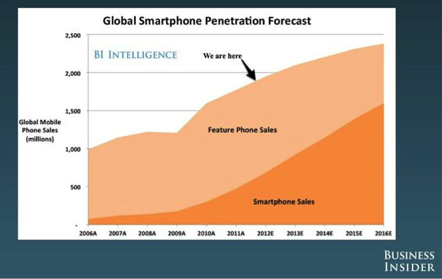
So what does that mean for your business? Well you might as well get on the bandwagon right now because pushing off the decision to customize your website for mobile will make it that much more painful in the future. Don’t be the one who didn’t get the “Flu Shot” and then ends up in bed on antibiotics for 2 weeks. Just accept the small “prick of the needle” now and get on with it!
So here are your options:
1) Build a Mobile App
2) Build Mobile Landing Pages
3) Build a website with Responsive Web Design (RWD)
No matter which one you choose you need to be aware of the implications for Conversion Optimization.
Here is an example of how we apply Conversion Optimization to a mobile site.
I did a search for “iPhone Accessories” and here is one of the results that appeared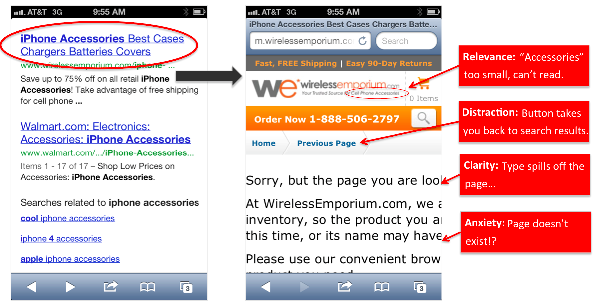
As you can see there are a number of issues I encountered after clicking on this result. The first and biggest concern is that the page doesn’t exist – which isn’t necessarily a problem with the mobile version – but this is further accentuated by the fact that I can’t even read their disclaimer.
The point is that you need to begin paying close attention to what you site looks like on mobile. I even know some designers that start their website design process with a mobile layout and then move to a browser version. Either way we can help you identify opportunities and help implement key improvements.
Mobile isn’t easy to do well – it has a lot more constraints. However, with the growth we are going to experience it is no longer an option and those who do it well will be rewarded.

- The Mom Test and Sparking Behavior Change: ‘How I Work’ EP16 with Sean Higgins (BetterYou) - February 7, 2022
- ‘How I Work’ Ep 15 with Ryan Truax - November 4, 2021
- What To Look For In A Digital Marketing Agency - February 4, 2021