8 Best Practices When Building a SaaS Landing Page
Don’t waste your time filtering articles, lists, or third-party review sites. We’ve compiled best practices and examples, and observations to save you time and energy when optimizing your landing page.
You may have the industry’s best SaaS product but struggle to convert organic traffic into marketing qualified leads. Hours of marketing research might leave you wondering what competitors are doing to outrank you in search results. In this article, we will cover the most effective ways that companies can compete in organic search with their landing pages, using examples and expert advice.
Introduction to Landing Pages
Suppose you’ve come across this article while figuring out how to best optimize your existing SaaS landing page. In that case, you should probably skip this section. Here, we’ll provide a clear understanding of what a landing page is, what it covers, and the primary objective in any industry.
- Definition of a Landing Page
- What a Landing Page Should Cover
Definition of a Landing Page
Over time, this web page has also been known as a “lead capture page,” “static page,” or a “destination page.” Here, we’ll be narrowing our focus to the scope of “Landing Page” and covering what that means and entails for your website. At its core, a landing page appears in response to a user clicking on a search engine optimized result, marketing promotion, email, or another form of online advertising.
The primary difference between a landing page and any other page on your site is that it must capture leads. Usually, these pages have short forms to fill out to receive a follow-up from a representative. A landing page should always have some way to record a user’s interest in your product or service so that your company can follow up afterward.
What a Landing Page Should Cover
There are two main types of these landing pages; reference and transactional. A reference landing page provides information about the product, service, or related topic of interest. It can isolate the visitor from distracting elements like navigation bars or associated links. It will convince the user to take action and records a lead. The second type of landing page is transactional. The purpose is to persuade the visitor to take action by completing a transaction. This will take the form of a text field that requires a name and email address submission in exchange for a free quote, trial, demonstration, or other promotion.
Landing Page Best Practices
Now that you understand what a landing page is and how it works let’s discuss some of the most relevant practices to follow when creating or editing your own. Once again, we’ve covered these practices by categories listed below, which you can skip to directly if you’d like.
- Good Landing Page SEO
- Keyword Mapping
- Written Content
- Backlinks
- Good Landing Page HTML/CSS
- Headers and Metas
- CSS Minifying
Good Landing Page SEO
SEO, or Search Engine Optimization, is the process of curating, organizing, editing, strategizing, drafting, revising, and testing…did we lose you yet? SEO is a scientific discipline that covers a broad range of tactics and methods that its practitioners rely on to ensure their content is optimized. Of course, when we say content, we’re referring to the organic content, just like your landing page! And when we say optimized, we’re referring to content that ranks highly in Google’s search engine results.
Keyword mapping
Let’s start with Keyword Mapping, or determining your landing page’s ability to align with a user’s intention when searching for your product or service. This part of our article assumes that you have formal knowledge of what keywords are and how ranking for them generally works. If this topic sounds utterly new to you, check out our article here.
We trust that you know your buyer personas quite well, which would make it easier to group them by their intentions while defining them. Then, after acknowledging their choices, it becomes easier to specify the types of things they search for. Finally, those definitions will contain the phrases, questions, sentiments, or one to two-word phrases that you should extract into your keyword list.
The next step is to ensure that there are no other pages of your website that could feasibly target the exact keywords as this landing page. Not doing so could result in Keyword Cannibalization, which we cover in this article. Keep this list handy, as we’ll refer to it a few more times through this section.
In summary,
- Start by identifying the intentions of your various buyer personas or other groups of visitors to your site and this specific page.
- Identify how they would search for your product or service based on their intentions.
- Isolate the phrases, questions, sentiments, and one to word phrases that you can extract into a keyword list
- Ensure beyond a reasonable doubt that there are no other pages of your site that could target the exact keywords as this landing page
Written Content
After Keyword Mapping, SEO is reflected through your Written Content. For information about writing composition and effective copywriting, refer to our content experts’ take here. Here, we’ll cover ways of determining if your landing page offers enough value in organic search by hosting enough qualifying content.
The first is by looking at your word count through paragraphs or lists on-page. The text in your website’s header or footer sections, along with any disclaimer messages or navigation elements, shouldn’t count towards this. Effective word counts for high-value organic content range depending on whom you ask on the internet. We think that the sweet spot falls between 1200 to 2000 words. If you’re coming up short, start by highlighting keywords or intentions you aren’t currently addressing. If you’re coming up beyond the effective range, identify information that doesn’t directly relate to the list.
After word count, it would help if you directed your attention to relevance. Refer to your keyword list, and identify any questions from the intention discovery that resulted in any keywords. Does the content that you currently have available address most, if not all, of the intentions and keywords? You should be able to quickly highlight the remainder of your keyword list that isn’t targeted on-page.
After cutting out irrelevant content, highlight topics or sections that target your keyword list. You should notice groups of themes. Ideally, your paragraphs will have Headers that include the main keyword inside those groups. It’s vital to ensure that each Header you have before a section contains the targeted keyword that the paragraph below will detail. As the subject matter expert, it’s up to you to decide how best to layout your content so it flows thematically.
Backlinks
Lastly, we’ll conclude our discussion about Landing Page SEO by briefly mentioning Backlinks. Backlinks are just links from one website to a specific page on another website. You may already use plenty of internal links on your landing page or throughout your website to allow users to navigate through it quickly. Backlinks are like votes of confidence that other websites can give your website’s content.
Think back to those user intentions and keywords you listed. Then, when replicating those searches yourself, you’ll see your main competitors likely already ranking on result pages. Additionally, you may find journals, blogs, or accredited groups like clubs, associations, and conferences. These entities probably have websites that provide information, reviews, or suggestions to your audience about the identical products or services that your company offers.
On these articles, they would have Backlinks to your competitors’ landing pages. Apart from having precious organic content on their pages, your competitors likely have Backlinks from these entities. There are several ways to obtain these links that aren’t directly relevant to our process here. We mentioned them to get you thinking about them once you’ve finished polishing or revising your existing landing page.
Good Landing Page HTML/CSS
Let’s start with Header and Metas, or how you’ve decided to present your written content. This is often the lowest hanging fruit on any given page that can be quickly changed, with results being reflected within a few weeks. As we mentioned earlier, Headers are the titles above your paragraphs, like “Good Landing Page HTML/CSS,” as written in this article. Headers are denoted in HTML with “<h1>”, where the number can be a value up to 6. The number of a header determines where it goes in the content. The h1 Header is always the title of the page itself. It should contain the most important keywords you want to rank for.
All forthcoming headers should align with your content layout. For example, subsections of primary sections should be titled with H2s, and those subsections should be titled with H3s. In addition, your headings should contain the most important keywords for each group of topics, and the content should be relevant to the subject without repeating the keyword too much.
Metas are what we call “meta tags,” a type of HTML attribute that allows you to add information behind the website that Google can see. There are all kinds of meta tags, but we’re going to be focusing on “description” and “title” tags. While the H1 header we discussed above defines the page title, you will still want to add a custom meta title tag to your page. This is because meta titles appear as the main text in a Google search result (often underlined), and meta descriptions are what appear below the mark.
Now let’s discuss CSS Minifying, which can sound quite daunting. Still, it promises a tangible result as soon as you implement it. All the branding, logos, assets, and other colorful objects on a webpage are the CSS (Cascading Style Sheets). After loading the HTML of a web page, Google then polls the CSS instructions to figure out how to show you the content itself. Unfortunately, these instructions are lines of code, often long and abundant, frequently having significant space gaps between sections.
By minifying the CSS, we are essentially consolidating the long threads of code into smaller spaces, allowing the page to load much faster. All you have to do is access the platform your website is managed. Once inside, you should be able to locate the “CSS” file for that particular page. You can copy all the CSS inside this file and paste it into Toptal’s website to receive an output. Please copy and paste this output back into the CSS file you saved before uploading it to your website’s platform. To test your website, visit Google’s PageSpeed Insights tool, and place the URL of your page for analysis. Properly minified CSS will show up as an item under “Passed Audits.”
Effective Landing Page Conversion
We’ve spent much time discussing and identifying the potential strengths and weaknesses of your existing SaaS landing page. We’re going to shift our focus towards the last best practice you should consider before covering examples of the best ranking pages at the end. This will be the Call to Action (CTA) or your landing page’s conversion.
You may think that any sales-driven users visiting this page are the conversions, and you would be right. However, recall that the primary purpose of a landing page is to capture and generate leads. Therefore, the primary purpose of your SaaS Landing Page should be to capture or generate leads that convert into sales. We came up with a shortlist of CTAs you can use to accomplish this, with some brief information about what they entail.
Opt-In
An Opt-In page is as simple as it sounds in concept; a page designed to allow users to “Opt-In” to receive communication about your company. This communication could be information about your products or services, updates in software development, or seasonal sales and promotions. A standard Opt-In CTA can be as simple as asking for an email newsletter subscription.
Appsumo places its CTA in the middle of its home landing page when searching for its business on Google. After scrolling past the initial offers, this CTA utilizes colorful elements in its composition to attract the users’ attention. In addition, the accompanying request to get deals and discover new products is made enticing by inviting the user to enter their email address.
Free Trial
The “Free Trial CTA” offers users the opportunity to use the product or service your company produces for a limited time. It’s your discretion to limit the features of the trial versus offering the paid version.
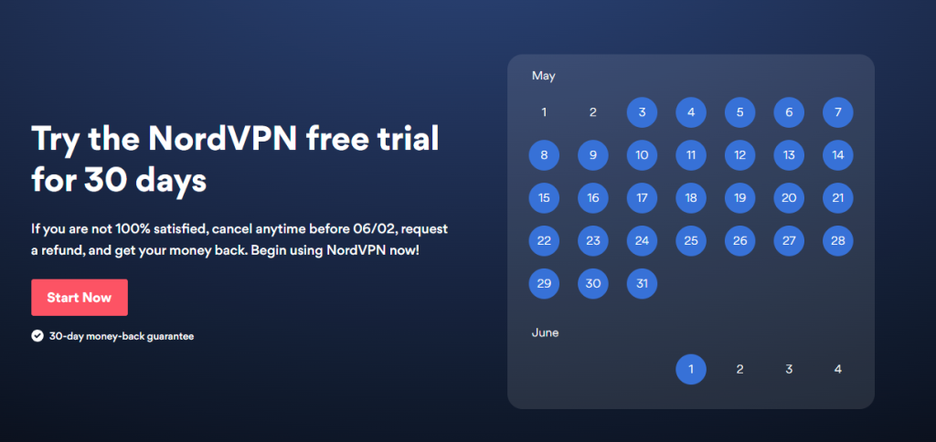
When searching for “nordvpn free trial,” search results take us to NordVPN’s landing page on the URL slug “/risk-free-VPN/.” The accompanying graphic is displayed prominently at the top of this landing page and uses brighter UX elements. For example, the calendar graphic reflects the actual date in the present, visualizing the realistic timeline for the trial for the user. Then, the accompanying text places the exact date for the cancellation deadline to be refunded.
Demonstration
Unlike the previous CTAs, we believe the demonstration is more robust in its offering. A demonstration gives you an in-person touchpoint with the prospect where you can continue to sell your offering. The demonstration is valuable to the user because it gives them a chance to ensure it aligns with their needs.
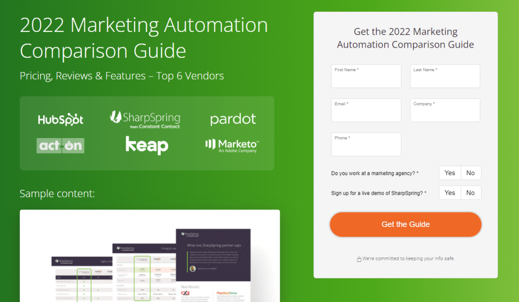
When searching for “marketing automation comparison,” search results show an advertisement for a side-by-side vendor comparison of marketing automation tools. Upon clicking through, the user is brought to SharpSpring’s landing page for their Revenue Growth Platform. Unlike previous landing pages discussed, this one focuses on providing the user with a free guide comparing the top vendors available in exchange for their lead information. Included is a live demonstration of SharpSpring’s platform.
Best SaaS Product Page or Service Landing Page
Before concluding the best practices for your SaaS Landing Page, we’ll show you the current highest-ranking results. Additionally, we’ve provided context below each SaaS example that reviews why that particular page ranks following the topics we’ve covered here. Finally, we aren’t using the first organic result for any given search listed below. Instead, we’re focusing on the best result from a SaaS landing page in organic search.
The Best Communication SaaS Landing Page
Searching Google for a “communication saas platform” returns several paid results and several organic third-party lists before showing us a result from little saas.
As we covered in our metas section earlier, the title of this result is clear and concise. It features all the keywords we used in our search query, demonstrating this page’s ability to match user intention. The description below is succinct while still effectively conveying the purpose of their product.
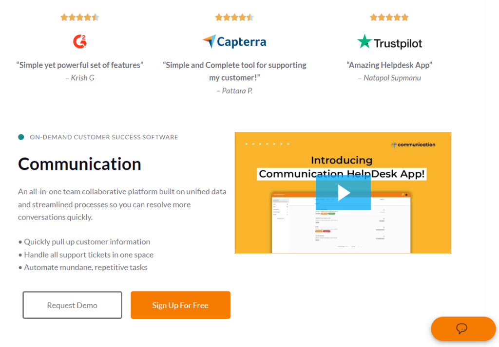
Clicking through brings the user to their landing page, utilizing white space to get attention to critical elements. There are testimonials at the top of the page, with recognizable logos. In addition, there is a short video embedded on the page to assist the user in understanding more about the product, placed near the chat assistant button. This company is also making effective use of two different CTAs; the demonstration and free trial.
Clicking on the demonstration button pulls up a Calendly integrated widget to book time directly through a calendar without taking the user to a separate page. When the user clicks on the free trial CTA, they go to a pricing and sign-up page featuring product bullets and a simple form. In this way, Little SaaS can effectively measure the performance of two different lead capture strategies through organic search.
By referring to our list of best practices, we can easily see why this company is dominating organic search results.
Good Landing Page SEO
- Keyword Mapping – Does the page align with a user’s intention when searching for related products or information?
- Yes. When the user is searching for a “communication saas platform,” they intend to find a solution of this kind. Someone has correctly identified this intention and likely mapped combinations of that query as keywords for this page.
- Keyword Cannibalization – Are there any other pages competing for the exact keywords?
- No. Returning to the search results does not show any other pages of the Little SaaS website in organic results, even on the second page.
- Written Content – Word Count, Relevance, Thematic Flow, and Backlinks?
- Word Count – Falls around 2500-2700 words by our estimates. While it is outside the range we recommended, it’s working for this company.
- Relevance – Quickly skimming through the page reveals that most of the headers and paragraph text listed are relevant to the problems potential prospects can relate to. By addressing different pain points, this company ensures relevance through various keywords that match intentions defined on varied pain points.
- Thematic Flow – By looking at bold-faced headers, the page repeatedly mentions “communication,” “benefits,” “team,” and “platform.” However, each additional Header dives into a different pain point before providing context and examples of how the solution will help. In this way, it’s easy to identify themes targeted by different sections based on the varying keywords used in headers.
- Backlinks – Backlink profiles can be checked using tools like ahrefs or SEMRush, which we won’t cover in-depth here. We’ll trust that Little Saas has credible backlinks from trusted sources to be ranked so well for this search.
Good Landing Page HTML/CSS
- Headers and Metas – Are headers laid out linearly while including keywords, and are appropriate meta tags used?
- Right-clicking the page and viewing the page source or inspecting the element by right clicking a particular bolded section title confirms that the page is designating h1 tags and h2 tags where needed. All h1 tags use keywords that would match the intentions of most users interested in this page. The meta title and description tags are complete with relevant information.
- CSS – Has the CSS been minified or otherwise optimized?
- Using Google’s PageSpeed Insights Tool on this URL, we can see “Minify CSS” as an item under the Passed Audit section, confirming minification.
The Best Email Marketing SaaS Landing Page
Searching the phrase “email marketing saas” in Google, scrolling past paid ads, “ultimate guides,” and listicles brings us to an organic result for Messaged, featuring their product’s landing page.
You’ll be able to quickly identify why this particular result is winning organic searches for this query.
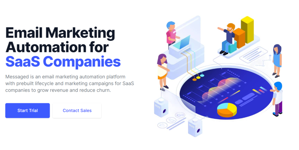
Similar to our previous example, Messaged utilizes two different CTAs on-page while prominently featuring a header at the top that includes keywords aligning with user intention. We challenge you to refer to the previous checklist we answered and identify why this page is winning in organic search based on those criteria. Luckily for you, this landing page is much shorter, so you’ll quickly identify areas for improvement (sorry, Messaged). This landing page could likely beat the results above by improving those areas.
Build your best landing page with Augurian’s team
Suppose you find yourself at the end of this article. In that case, we hope you’re walking away with a new or improved understanding of landing pages. Specifically, we hope you can build one for your SaaS or use relevant practices to optimize better. In general, there’s no best way that we could imbue our combined years of expertise in the SaaS industry into a digestible post for you to consume. Everything we’ve covered is more than enough to get anyone started. Still, the ability to convert leads and rank well will be amplified with the help of an agency. At Augurian, we implement various solutions that scale with your business, so contact our team today to find a suitable solution for you.
